Tables and Charts
Researchers use tables and charts to communicate their ideas.
Tables
Tables are a useful way of presenting numerical data. The numbers are presented in vertical columns and horizontal rows. Tables can organize the data longitudinally or by cross section.
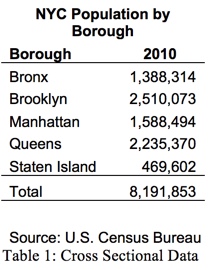
Cross sectional data divides the data into its component parts. Here us an example of cross sectional data:
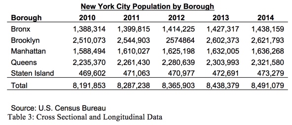
Longitudinal data shows how the data changes over time. Here us an example of longitudinal data:

Cross sectional and longitudinal data can be combined in a single table:
A good table should have:
- A title that identifies the data presented
- A table number
- A legend, if needed
- A source
Charts
Charts provide a graphic representation of data. Just like tables, a chart should have:
- A title that identifies the data presented
- A chart number
- A legend, if needed
- A source
Bar or Column Charts
Bar charts are used to present cross sectional data. The heights of the columns depict the size or magnitude of each section
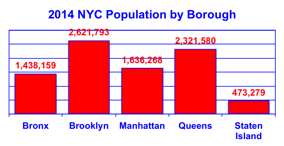
Chart 1: Bar or Column Chart
Pie Charts
Pie charts are used to present cross sectional data. They show the proportion of each section
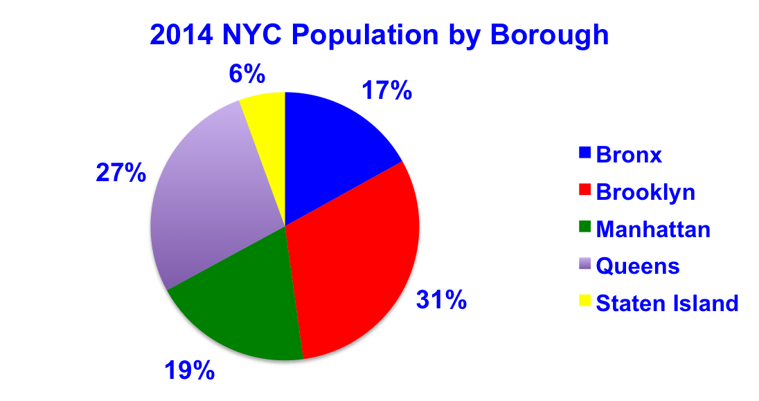
Chart 2: Pie Chart
Line Charts
Line charts are used to present longitudinal data.
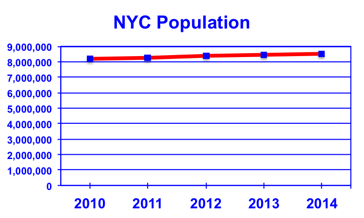
Chart 3: Line Chart
toc | return to top | previous page

